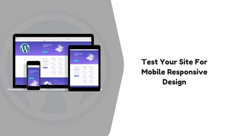
Need to test WordPress site for mobile responsive?
A website is said to be responsive if it adapts its layout based on the screen size of the device in which it is being viewed. This factor is becoming more and more important now-a-days in this era where the headcount of smartphones and tablets are steadily increasing and a large number of such devices are getting connected to the internet every single day.
Google, the search engine giant declared more than a year ago that the rank of a website over its search results will now be determined based on the mobile-friendliness of a website. Although the same has not been taken fully into consideration, it is expected to be done real soon. WordPress has made developing a website really easy and it’s high time these websites get incorporated into a mobile responsive design too. Let’s have a look at some of the easy yet efficient ways to test WordPress site for Mobile Responsive Design.
-
Browser Resizing – WordPress Site for Mobile Responsive
This is one of the simplest ways to get started in knowing if a website is mobile responsive or not. All we need to do is open up the website on a browser in our laptop or desktop and then resize the browser to see if the contents of the site adjust themselves according to the size of the window. If a website is mobile responsive then its contents will adjust itself to ensure that they appear one below another on the screen without overlapping.
The entire content of the website should be accessible by the usage of scrollbars if the website is mobile friendly. There can be instances where issues with the CSS class specified for menu or buttons make them overlapped to the content or any other entities on the page, the same can be taken care of my modifying the CSS of the website and then re-verifying using the same technique. Although this approach is pretty straightforward and simple, yet it is a decent strategy to inquire whether a website has a mobile responsive design.
-
Manual Testing – WordPress Site for Mobile Responsive
The fact that a website is responsive to a mobile device or not can be verified using a mobile, tablet or any other device itself by opening up the website in any of the browsers present on the device. Although this might not give an accurate result of what is intended out of our experiment for the degree of responsiveness may vary from device to device but it can be safely assumed that if a website is responsive on an android device it will be responsive to almost the same extent on any other android device as well.
The same is true for iOS devices also. So, if one decides to go by this approach, choosing the most widely used device for respective platforms might come in handy. This would require a survey of the devices which the target audience of the website uses so that the platforms, as well as the devices, are taken into consideration while choosing a device. This strategy creates a small hole in the pocket of website owners and is not one of the most recommended ones due to this constraint.
-
Browser Developer Tools – WordPress Site for Mobile Responsive
With advanced and up-to-date browsers at our disposal, developers have really efficient ways to utilize the underlying features of the browser to test if a WordPress website has a mobile responsive design. Let’s have a look at a few of the most popular browsers and understand how one can utilize the inbuilt features these have in store to serve our purpose.
Google Chrome
One needs to open up the website in Google Chrome and then Right Click to select Inspect Element from the list of available options which pops out. This opens up a window on the same tab either on the side or bottom. Click on the device toggle toolbar present on the top panel of the Inspect Element section.
This would change the view of the website from desktop to a mobile device and also show if the site has a mobile responsive design or not. We have options to select from many listed devices and also add custom devices. Also, we can change the resolution to see the degree of responsiveness of our site.
Safari
This browser provides the feature to see how a website responds to Apple devices. The Enter Responsive Design Mode under the Develop section in the browser provides this feature. Here, we have options to check how the site looks at many Apples devices. It is a useful way to see how the website responds to older and new models of iPads and iPhones.
-
Online Emulator – WordPress Site for Mobile Responsive
There are a few emulators available online which help us visualize how a site looks or how well it responds to a particular website. In this age, where a new device gets launched almost every day, this is a neat way to go around with staying on track and ensuring that almost every target device gets covered. Some of these tools also let us know if our website is mobile responsive or not. Let’s have a look at some of these online tools available at our disposal.
MobileTest.me
This allows us to select a device out of the available list of devices and then check out our website on the same.
Responsinator
Although mainly focused towards Apple devices, responsinator also supports a few android devices and enable us to view the simulation of a website opening up in these devices.
Other available tools like Am I Responsive, Google’s Mobile Friendly Test also enable us to know if a WordPress site has a mobile responsive design.
Hence, we can use any of the aforementioned ways to check out if our WordPress website has a mobile responsive design. We can also try out a combination as most of these are freely available and can be used pretty easily. A WordPress site is majorly dependent on its theme for its responsiveness.
We have WordPress plugins like WPtouch, Superfly, AMP, Touchy which help in creating our WordPress site mobile responsive by preserving the existing themes and integration so that there’s no difference in quality or experience in browsing through the website.
End Note – WordPress Site for Mobile Responsive
It is of utmost importance in today’s word to ensure that our websites are responsive to any and every kind of devices present over the internet to account for the fact that we have a large count of the target audience for our website.
Since people prefer to browse kinds of stuff on the go, using a laptop is not always feasible and if a website offers similar experience over devices like mobile phones or tablets then people will surely be interested in opening up the same over other similar websites that don’t have this feature.