Need to optimize WordPress for mobile?
The usage of mobile is persistently skyrocketing, and it shows no signs of dropping in the near future. Today, the majority of people are using modern mobile devices like smartphones, tablets, wearable, etc., to access the Internet.
Thus, it has become more than imperative to ensure a surefire web presence to target your mobile users, which indeed are the majority. This has certainly led to the need of optimizing a website wordpress for mobiles.
Moreover, a website that doesn’t scale appropriately for mobile devices also gets impacted with a poor search rank.
This is because of the updated search algorithm of search engines like Google that prefer mobile-friendly websites over regular sites.
Having said all these, there are several compelling reasons to switch your existing WordPress site into a mobile-optimized website. Let’s decipher some noteworthy tips that must be considered to ensure a prolific site’s performance for mobile visitors.
Scrutinize your website – Optimize WordPress for Mobile
Before delving deep into any step, it is advisable to seek your web elements that can distract your mobile viewers or adversely impact your site performance. Here are certain points to look after.
Form Filling:
Asking your visitors to fill a lengthy form to proceed further can leave your users frustrated and thus, encourage them to abandon your site. Considering the fact, that it is hard to fill forms on small screens and mobile users are often less patient, it is recommended to minimize the details as much as possible if your site really demands any information to be filled by users.
Size of Files:
Using bulky graphics can ruin your site performance, especially on mobiles. Thus, to ensure an instant loading, it is advisable to optimize your file sizes and keep it as minimum as possible.
Flash and Java:
Since, Flash and Java are not supported by many of the mobile platforms, it is better to avoid them.
Lengthy Posts:
Lengthy blogs without breaks can annoy reader when they are accessing your site from a small-screen device. Thus, it is advisable to break huge post into small and easily readable paragraphs and give suitable headers to maintain the legitimacy of your website.
Number of Pages:
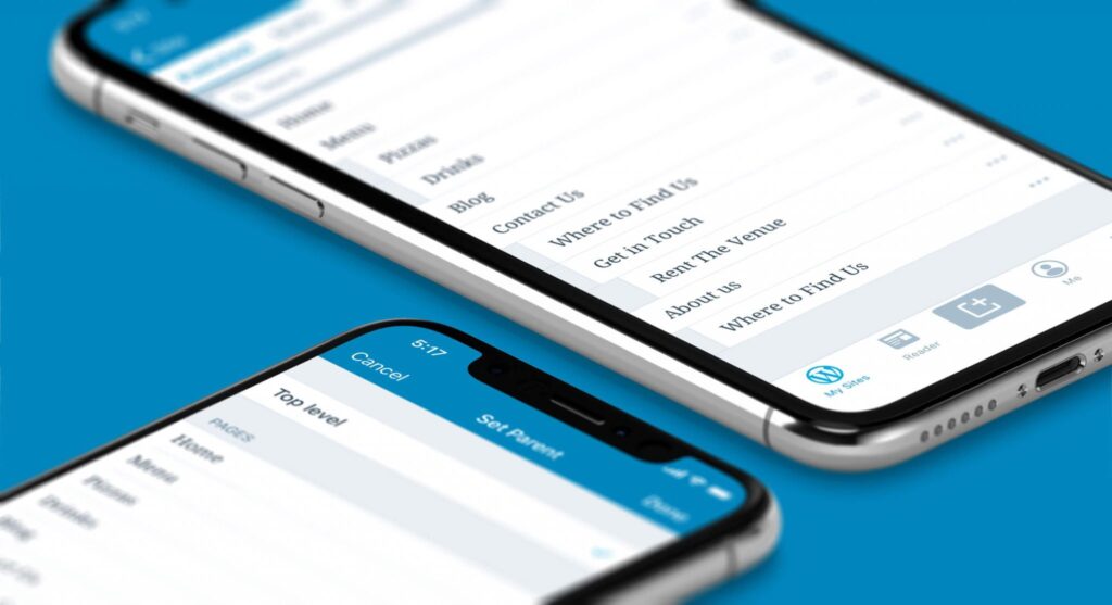
Due to the small screen of mobile devices, most of the navigation is supported via scrolling. For this reason, one-page websites are more suitable for handy devices. It doesn’t imply that multiple pages shouldn’t be included in a website, they are fine, as far as they are easily navigable from the menu. Thus, it is better to avoid clumsy categorization and most importantly, it is a strict no to the pop up windows.
Streamline your choice for a suitable Hosting Plan – Optimize WordPress for Mobile
There could be several reasons behind the poor response time of your website. However, one of the most eminent factors is a bad web hosting plan. Maybe your hosting company is not that inefficient, but the efficacy of your chosen plan is what that matters.
It can help buttress your site performance. For instance, in a shared hosting plan, there are numerous websites hosted on the same server, which can cause substantially slow loading time.
To combat this problem, it is essential to consider your website’s needs while streamlining a hosting plan and choose one that can ensure a smooth and fast performance. It is also advisable to don’t choose by the prices, but take the quality into account. Choose a hosting plan that can efficiently manage traffic spikes.
Optimize the featured images for the web – Optimize WordPress for Mobile
Images are, no doubt, an invaluable asset to blogger that can add life to a content. It not only helps entice viewers to read the content, but also makes the content more legible. Thus, to make your WP site mobile friendly, one has to deal with the integrated images.
Huge and bulky images will definitely add to the loading time. Thus, one must optimize the images before uploading them on his website.
Fortunately, there are several useful plugins available that help compress images for the web, without tinkering with the image quality and thus, ensuring a superlative quality on desktops and mobiles as well. You may choose to use plugins like, WP Smush, Lazy Load or any other that best cater to your needs.
Choose an expeditious WP Theme – Optimize WordPress for Mobile
A poorly coded design and multiple graphics on a page certainly make a page heavier and thus, creates performance bottlenecks. This is why, it is recommended to seek themes that are lightweight, otherwise it can add to your page load time.
Fortunately, there is no dearth of options in the WordPress theme repository, you can have a slew of themes optimized for various mobile devices and desktops.
You can choose a theme that is responsive in nature or go with an adaptive design, which can help you proficiently reach the targeted device. Adaptive designs are ought to deliver an improved UX by delivering considerably lightweight web pages.
Don’t forget to test your website – Optimize WordPress for Mobile
After making painstaking efforts, it is worth to check the result and ensure hiccups-free performance. Don’t blindly trust responsive design and your code. It is always worthwhile to test your product on devices, as it is hard to guarantee a flawless result to target diverse mobile ecosystem.
You can test by running your website on a variety of mobile devices featuring different resolutions and platforms, to check whether it is running smoothly and appearing appealing or not. You may choose to use an emulator or test your website on real devices, whatever is convenient to you.
By taking these guidelines into account, you can make your website more effective and efficient for your mobile visitors. This will certainly help you boost your website visibility on the web and deliver a smooth and remarkable UX on any device. Thus, these tips can help you proficiently leverage your business.